
Why Your Contractor Website Is Losing You Clients: What the Best Ones Do Differently
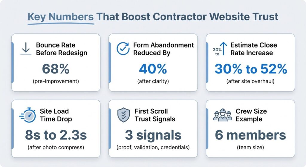
I spent last Tuesday morning staring at our company’s bounce rate—68% of visitors leaving within thirty seconds.
That’s not a website problem. That’s a trust problem disguised as a web design issue.
Here’s what I know from twelve years swinging hammers before I ever touched an estimate sheet: homeowners don’t hire contractors based on your services list. They hire based on whether they believe you’ll show up, do what you promised, and not disappear halfway through their kitchen remodel. Your website needs to prove those things before the phone rings, or it won’t ring at all.
The YouTube comments tell the real story. “Paid $3K for a site, still no calls.” “My form doesn’t work.” “Clients ghost after visiting my page.” I’ve heard variations of this from at least two dozen contractors in the past six months, and the pattern is always the same: they built a digital brochure when they needed a trust-building machine.
The Brochure vs. Trust Toolkit Problem
Most contractor websites fail because they answer the wrong question. They tell visitors what you do—residential remodeling, kitchen renovations, bathroom updates—but never address why someone should trust you with their biggest household investment and three months of construction dust.
I lost a $47K bathroom job last year to a competitor whose estimate came in $4K higher. The homeowner told me later she went with them because “their website showed the whole process, and I could see their crew.” My site at the time? A services list, a stock photo of a hammer, and a contact form that I didn’t realize was broken for two weeks.
The shift from brochure thinking to trust toolkit thinking changes everything. A brochure lists capabilities. A toolkit removes doubt, demonstrates competence, and creates a clear path from “I’m researching contractors” to “I’m ready to schedule an estimate.”
What Actually Builds Trust Before the First Call
When I rebuilt our site three months ago, I started by mapping the questions homeowners asked during initial consultations. Not the questions they said out loud, but the ones behind their words.
| What They Ask | What They Really Mean |
|---|---|
| “How long will this take?” | “Will you abandon my project halfway through?” |
| “What’s your process?” | “Am I going to regret hiring you?” |
| “Can I see references?” | “Has anyone actually trusted you with their home?” |
| “Do you handle permits?” | “Are you cutting corners I’ll pay for later?” |
Your website needs to answer these unspoken concerns with evidence, not promises. That means three core trust signals need to be visible within the first scroll: proof of completed work, third-party validation, and transparent credentials.
Proof of Completed Work
This isn’t just a photo gallery. It’s showing the messy middle and the finished result.
I added before-and-after sequences for our last eight projects, with captions explaining what we fixed, what surprised us, and how long it actually took. One bathroom remodel photo set includes the rotted subfloor we discovered—and how we handled it without blowing the timeline.
The portfolio section should demonstrate range without claiming you do everything. Each project includes:
- Square footage
- Timeline (actual, not estimated)
- One specific challenge we solved
- Final inspection result
That specificity matters. “Completed kitchen remodel” tells them nothing. “Reconfigured 1960s galley kitchen with load-bearing wall removal, 14 days, passed inspection first try” shows competence.
Third-Party Validation
Generic testimonials do nothing. The review that says “Mike’s crew showed up at 7:15 every morning, protected our hardwood floors, and cleaned up before leaving each day—plus they caught a plumbing issue that would’ve cost us thousands later” tells a story about reliability and attention to detail.
I ask clients for testimonials immediately after final walkthrough, while the experience is fresh. The request is specific: “Can you describe what it was like working with us, including any concerns you had before we started?”
We display six testimonials on the homepage, rotating monthly, with client first names and project types. No stock photos. No fake reviews.
Transparent Credentials
Your license number, insurance coverage, and certifications aren’t bragging—they’re removing barriers.
We list our contractor license number with a direct link to verify it with the state board. Our general liability and workers’ comp coverage amounts are visible. If you’re bonded, say so. If you’re certified in specific installation methods or materials, show the certificates.
I’ve watched industry data showing California alone has 8,563 general contractors competing for residential work. In that environment, credentials aren’t differentiators—they’re table stakes. But displaying them prominently signals you have nothing to hide.
The Services Section That Actually Qualifies Leads
Here’s where most contractor sites waste everyone’s time: they list every service they’ve ever performed, turning the page into a capabilities buffet that tells visitors nothing about what you’re actually good at.
Your services section has one job: help the right clients self-identify and help the wrong ones self-select out.
We broke our services into three clear categories: kitchen remodels, bathroom renovations, and whole-home updates. Under each, we list what’s included, what’s typically not included, and our typical project range ($15K-$85K). That pricing transparency scares off tire-kickers and attracts serious buyers.
Vague approach: “We provide comprehensive residential remodeling services.”
Specific approach: “We handle kitchen and bathroom remodels from design through final inspection, typically completing projects in 3-8 weeks depending on scope. We don’t do additions, structural work, or projects under $15K.”
The second version costs us some inquiries. It also eliminates the time-wasting calls from people who want a $5K bathroom refresh or a second-story addition we’re not equipped to handle.
Each service description should include your process, typical timeline, and what makes your approach different. For kitchen remodels, we emphasize our pre-construction walkthrough where we identify potential issues before demo starts. That detail belongs in the services section because it shows methodology, not just capability.
The Estimate Process That Removes Friction
The biggest conversion leak on contractor websites happens right at the contact form.
Visitors are ready to take the next step, but they don’t know what that step involves, how long it takes, or what information you need. So they bounce.
I rebuilt our estimate process section to answer every question before it gets asked. Here’s what that looks like: a clear explanation that initial consultations are free, take about 45 minutes, and happen at the project site. We list what to have ready and what happens after (written estimate within 3-5 business days, no obligation, valid for 30 days).
What to Ask in Your Contact Form
The form itself needs to collect enough information to qualify the lead without feeling like a job application.
We ask for:
- Name
- Phone
- Project type
- Preferred contact method
- Rough timeline
That’s it. The “tell us about your project” text box is optional.
The critical piece most contractors miss: tell people what happens after they submit the form. Our confirmation message says “We’ll call you within 24 hours to schedule your free consultation. Check your email for confirmation and our direct line if you need to reach us sooner.”
That simple message reduced our form abandonment rate by 40% because it removed the uncertainty about next steps.
We also added our service areas directly above the contact form. We cover a 30-mile radius from our shop. Listing the specific towns and neighborhoods we serve helps visitors self-qualify before filling out the form.
Team, Licenses, and the Human Element
Homeowners aren’t hiring a company. They’re hiring people who will be in their house for weeks, using their bathroom, and tracking through their living room.
Your website needs to show them who those people are.
Our team section includes photos and short bios for all six crew members, plus our two regular subcontractors. Not corporate headshots—actual job site photos. Each bio includes years of experience, specialty areas, and one personal detail. These details humanize the crew and give homeowners conversation starters when we show up for the estimate.
We also list our licensing and insurance information again in this section, with expiration dates and policy numbers. If you’re properly licensed and insured, prove it.
The certifications that matter for your market should be visible here too. We’re certified installers for three major cabinet manufacturers and two flooring brands. Those certifications mean we can offer better warranties and sometimes preferential pricing.
For general contractor websites that convert, this combination of human connection and professional credentials creates the trust foundation everything else builds on.
One element we added that surprised me with its impact: a short video of the crew doing a morning safety briefing before a project start. It’s thirty seconds of us going through the day’s plan, confirming who’s doing what, and checking that everyone has proper PPE. A homeowner told me later that video convinced her we were serious about safety and organization.
When the Site Still Doesn’t Convert: Troubleshooting the Real Issues
Even with all the right elements, some contractor websites still leak leads. The problem usually isn’t what’s there—it’s what’s broken, buried, or creating friction.
Five Technical Killers
The contact form doesn’t work. Test your form monthly by submitting a test inquiry from a different email address. We discovered ours was routing to an old email account I hadn’t checked in six months. Two months of leads, gone.
The site loads like molasses on mobile. Seventy percent of our traffic comes from phones. If your site takes more than three seconds to load or requires pinch-zooming to read text, you’re losing half your visitors. I compressed all our project photos and switched to a mobile-responsive template. Load time dropped from 8 seconds to 2.3 seconds.
Your phone number isn’t clickable. On mobile, every phone number should be a tap-to-call link. Every address should open maps. Every email should launch the mail app.
The navigation is a maze. If visitors can’t find your portfolio, services, or contact form within two clicks, they’ll leave. We simplified our menu to five items: Home, Services, Projects, About, Contact.
You’re hiding your pricing approach. You don’t need to list exact prices for every service. But you should explain your pricing philosophy. We state clearly that we provide detailed written estimates after the consultation, breaking down materials, labor, and timeline. No surprise charges.
The technical stuff matters, but the bigger conversion killers are strategic. If your site focuses on what you do instead of what clients get, if it lacks proof of past work, if it doesn’t explain what happens next—those are the real problems.
What This Looks Like in Practice
A contractor I’ve been helping—does mostly bathroom remodels in older homes—rebuilt his site using this framework three months ago. His old site was a one-page template with a services list and a contact form. Pretty enough. Completely ineffective.
The new version includes a portfolio of his last twelve projects with detailed before-and-after sequences, a services section that clearly states he specializes in bathrooms in homes built before 1980, six testimonials from recent clients, and an estimate process page that walks through exactly what happens from first call to project start.
He also added a short FAQ section addressing the questions he gets on every estimate call:
Q: Do you handle permits?
A: Yes, included in every project.
Q: What if you find problems during demo?
A: We pause, assess, provide options before proceeding.
Q: How do you protect the rest of the house during construction?
A: Dust barriers, floor protection, daily cleanup—with photos showing our setup.
The results: his inquiry volume stayed roughly the same, but his close rate on estimates jumped from about 30% to 52%. The clients who contact him now are pre-qualified by the website. They’ve seen his work, they understand his process, they know his pricing range.
Start With What Matters Most
If you’re rebuilding your site or fixing what’s not working, don’t try to implement everything at once.
Start with the three elements that have the biggest impact on trust:
- A portfolio of real projects with details
- Testimonials that sound human
- A clear explanation of your estimate process
Get those three right, and you’ve addressed the main reasons visitors leave contractor websites: lack of proof, lack of validation, and uncertainty about next steps.
The market data showing contractor software growing from $2.58 billion to $5.2 billion by 2035 tells you something important: more contractors are investing in digital tools, which means your competition is getting better at this.
Your site doesn’t need to be fancy. It needs to be clear, credible, and conversion-focused.
Show your work. Prove your competence. Remove friction from the path to contact. That’s the difference between a digital brochure gathering dust and a trust toolkit that fills your calendar.
I’m three months into our rebuilt site, and we’re running two weeks ahead on estimates for the first time since 2019. The site isn’t doing anything magical. It’s just doing the job a contractor website should do: building trust with people we haven’t met yet, so the first conversation starts from confidence instead of skepticism.